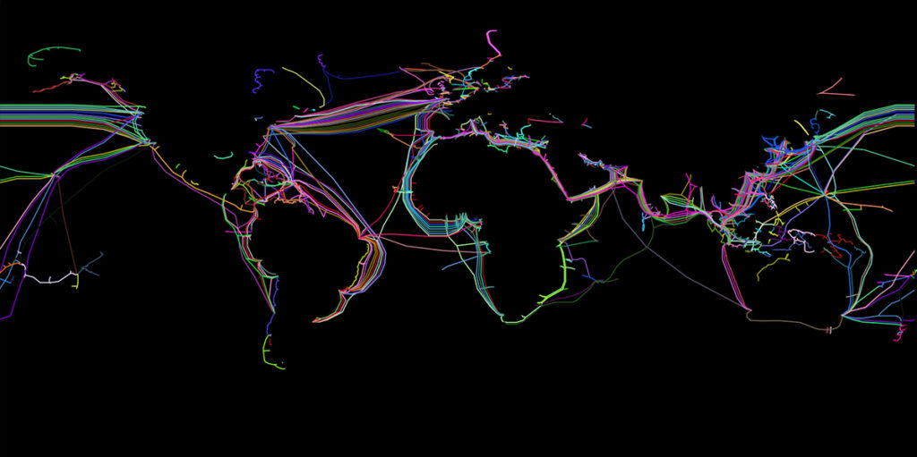
The website submarinecablemap.com displays all known submarine cables as colorful lines on a world map. An abundance of distinct lines run in parallel between Europe, North America and Asia, while other lines form into knots in places where cables are distributed and split into various directions, for example on the island Guam. The 1.2 million kilometres of cable (Brake 2019: 02) that are displayed on the map are responsible for distributing 99% of all internet traffic, which makes questions regarding their ownership and distribution politically relevant. In this contribution, I trouble the common visual of the submarine cable system, and suggest different imaginations and images of what the internet is and can be.
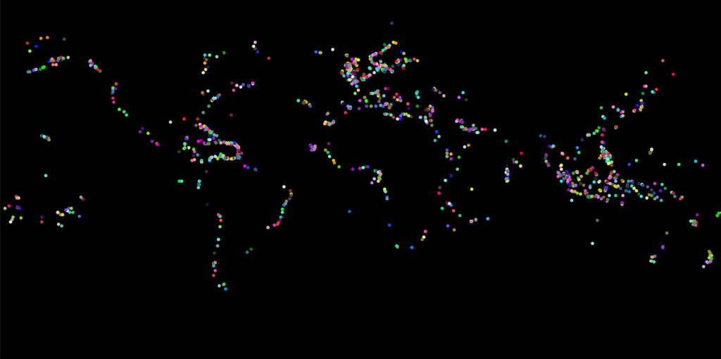
The map is published and maintained by TeleGeography, a company that collects and analyses telecom data. Luckily, it also comes with open source JSON datasets hosted on GitHub. This data format is not tied to a specific programming language, and can be parsed in languages such as Javascript. Drawing all available coordinates of the various cables with p5.js results in the following images:
Analysing the Map Otherwise
By just focusing on the landing stations, and with the help of a few simple programmatic operations, I retrieved some additional information from TeleGeography’s JSON files: there exist 1405 known landing stations world-wide, and from these, 1086 are situated above and 319 are situated below the equator, which means that the Global North has more than three times as many landing station than the Global South. On the image below, Northern landing stations are displayed as blue triangles and Southern stations as yellow dots.
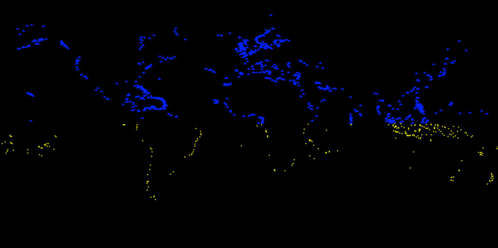
It is relevant to note here that the presence of internet cables at a country’s shore does not guarantee that its inhabitants have access to the internet. Scholar Dhanashree Thorat, who works on the internet’s colonial history and present, has shown that the African State Djibouti connects almost 50 countries through 12 cables, but only 18.5% of its inhabitants have internet access (2019: 270). This shows a limitation of the map and also my visualisation: it works with the coordinates of landing stations, not with questions around actual access to the internet. Yet, the amounts of landing stations already point to the problem of unequal distribution.
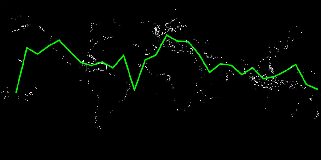
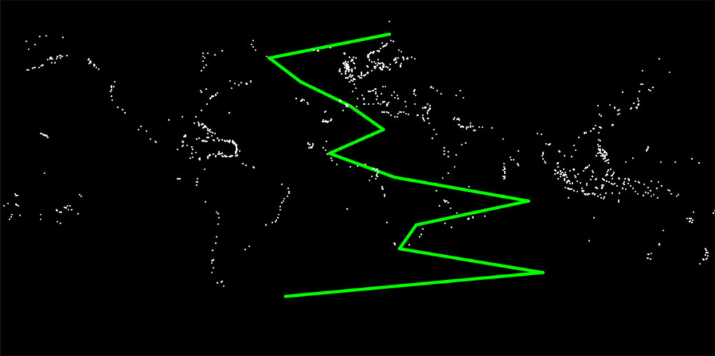
As a second experiment, I mapped the distribution of landing stations as a graph. By applying first a sorting and then an averaging algorithm, my program stepped through latitudes and longitudes in 10 degree steps. Displayed as a graph, the unequal distribution of landing stations becomes more apparent as the line spikes towards North America, Europe and East-Asia. Applied on the y-axis, the graph moves towards these same locations. However, because fewer landing stations exist in the Southern half of the globe, the graph has less data points to average with.
Connecting Otherwise
While the map does work with the coordinates of actual landing stations, the lines that connect them constitute not actual but “logical pathways between endpoints” (2015: 11), as Nicole Starosielski has argued. The straight display of cables and the flat representation of oceans follows a Western imaginary in which landscapes are easily modifiable: “the environments that cables are laid through — the oceans, coastal landing points, and terrestrial routes — are seen as friction-free surfaces across which force is easily exerted […]“ (ibid.: 05).
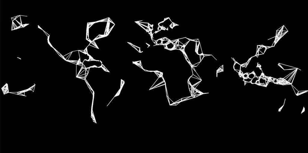
Inspired by the highly fictional nature of lines on the original map, I wrote a function to connect each landing station with the landing station that was closest to it in terms of latitude. If cables were laid out like this, it would mean a radically different and also inefficient and error-prone distribution of internet traffic. If one cable was broken, the rest of the world would be cut off from the internet. Yet, this graphic paints the submarine network as a rhythm or a pulse, and in a way that privileges the North a little less.
Distributing Otherwise
Thinking about distributing internet infrastructure otherwise, I started working on a function that would connect each landing station to a set of close-by landing stations. Here, a sorting algorithm that takes into account distances makes for dense triangular shapes in areas with a high density of landing stations, and creates long linear structures near the coasts of Southern countries. This internet is one of patches and absences, as the distances between shorelines are too large to be connected by the logic of close proximity. With this kind of internet, it would not be possible for an email I would send from Berlin to a person in the same city to be routed through the US.
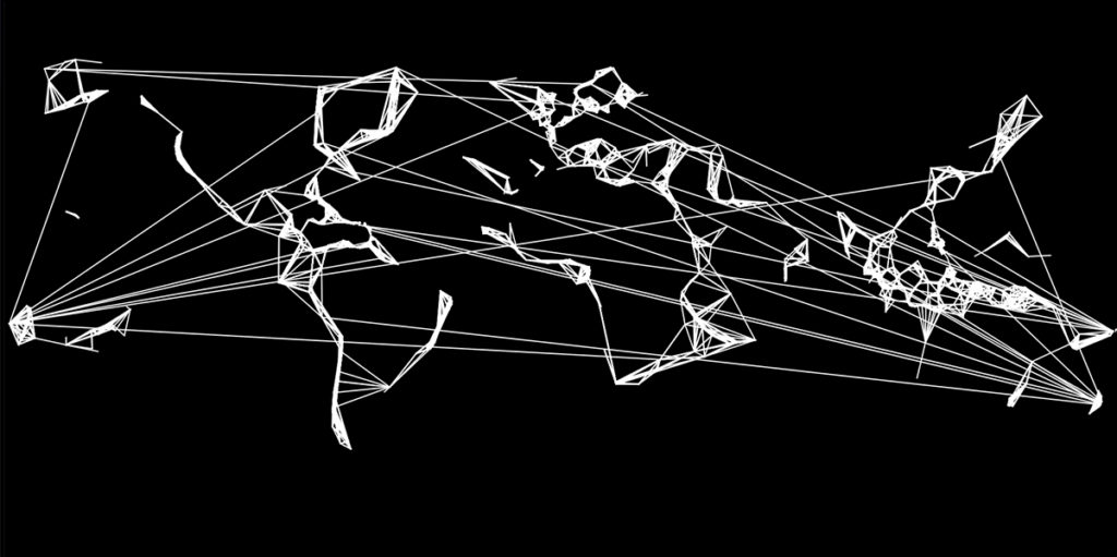
In the next example, every 50th landing station connects to the landing station that is farthest from it. Slightly flawed, because locations on the left cannot seamlessly connect to locations on the right, this function draws an internet of closeness and distance. Small networked patches would still exchange traffic with far away locations, but compared to the original map, long distance connections are far more equally distributed across the globe.
Drawing Internet Otherwise
I’m closing this short contribution with a PDF that you can download and draw on. It contains all known landing stations, but you may want to add more or distribute the existing ones differently along the page. I invite you to play on this sheet of paper: print it, and use some colorful pens or materials such as coffee to draw new cables between the dots. What kind of otherwise internet infrastructure do you dream towards? What are the values you will work with, and the materials you will engage?
You can:
and if you have drawn/patched/soaked a different kind of internet and wish to share it, please post it and feel free to let me know via @isipaehr on Twitter.
Conclusion
With this project, my aim is to imagine internet infrastructure through different patterns, intensities, distributions and values such as equal access. Making data sets and visuals are always political acts: this does not exclude the original submarine cable map that I have modified throughout this blog entry. There are various ways one could play with the data sets that I have not yet experimented with. Rather than suggesting one single better way of distributing the internet, I hope to have shown that other ways of networking are possible and worth exploring.
References
Brake, Doug. “Submarine Cables: Critical Infrastructure for Global Communications”, Information Technology & Innovation Foundation, 2019.
Fuzzy Binaires. “B[ORDERS]” , workshop series in 2020.
p5.js. Software. https://p5js.org.
Thorat, Dhanashree. “Colonial Topographies of Internet Infrastructure: The Sedimented and Linked Networks of the Telegraph and Submarine Fiber Optic Internet.” South Asian Review 40.3 (2019): 252-267.
Starosielski, Nicole. The undersea network, Duke University Press, 2015.
Submarine Cable Map. TeleGeography, https://www.submarinecablemap.com (last accessed on 29.04.2021).
With thanks to Jasper Meiners for debugging support, and Loren Britton for copyedits.